Sixteen Android apps, and each one is about a single thing: a city, an art style, or a category like chess or wildlife. That constraint is the point. A collection built around one subject can be curated by hand, framed consistently for a tall phone screen, and written about honestly — which is what the page behind every card below tries to do. Each one explains what the set contains, how the images are composed, which frames suit a light or a dark theme, and what to watch for on your particular screen.


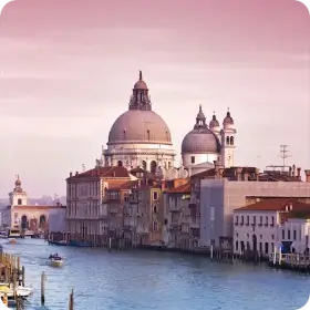
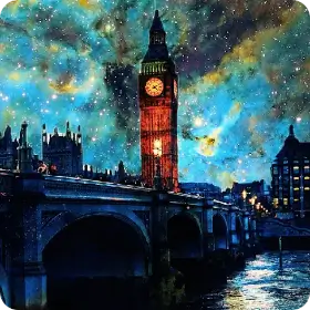


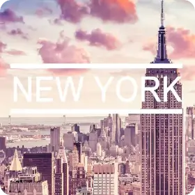


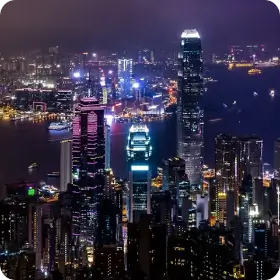
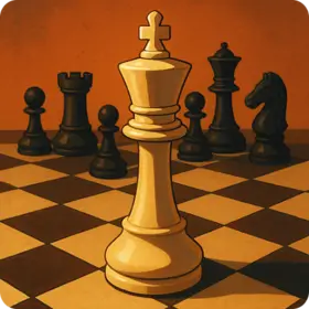




Every app is a fixed, hand-picked set rather than a feed. The images are prepared in portrait for high-density displays, so a landmark or a subject fills a 20:9 screen without the launcher cropping the interesting part away. Most apps are under 10 MB installed and ask for nothing beyond internet access, network state and the system wallpaper API. They are free, carry a modest ad placement to cover hosting, and never show an interstitial on launch.
The site does not host wallpaper downloads. The images live inside their apps on Google Play, where they are properly sized; the pages here are for deciding whether a collection is the one you want before you install it, and for getting the most out of it afterwards.
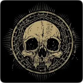
If you already know the look you want, the cards above are grouped loosely: ten city collections first, then chess, wildlife, cinema, two portrait sets and a dark set. If you do not, the theme finder asks six questions about light, colour and how you use your screen and points you at the collection most likely to suit you. Whichever you pick, the preview mockup and the contrast checker will tell you in a few seconds whether a given frame will keep your clock and icon labels readable.
The wallpaper side of this site is where most of the blog comes from: display technology, what a dark image really saves on an AMOLED panel, colour theory behind an icon grid, and how to size an image so it does not arrive soft or badly cropped. The theme pages lean on that writing rather than repeating it.

 EN
EN FR
FR ES
ES DE
DE